Showing the value before asking, from sign-up to TruthIn Plus
TruthIn is a shopping companion: scan a product's barcode and its rating system scores what's really inside. As the sole product designer, working with a PM, I redesigned the three places people were leaving: sign-up, the beauty product page and pricing.
My role
Sole product designer, with a PM
Scope
Sign-up, beauty product page, pricing
Timeline
From mid June 2026
Status
Live on iOS and Android
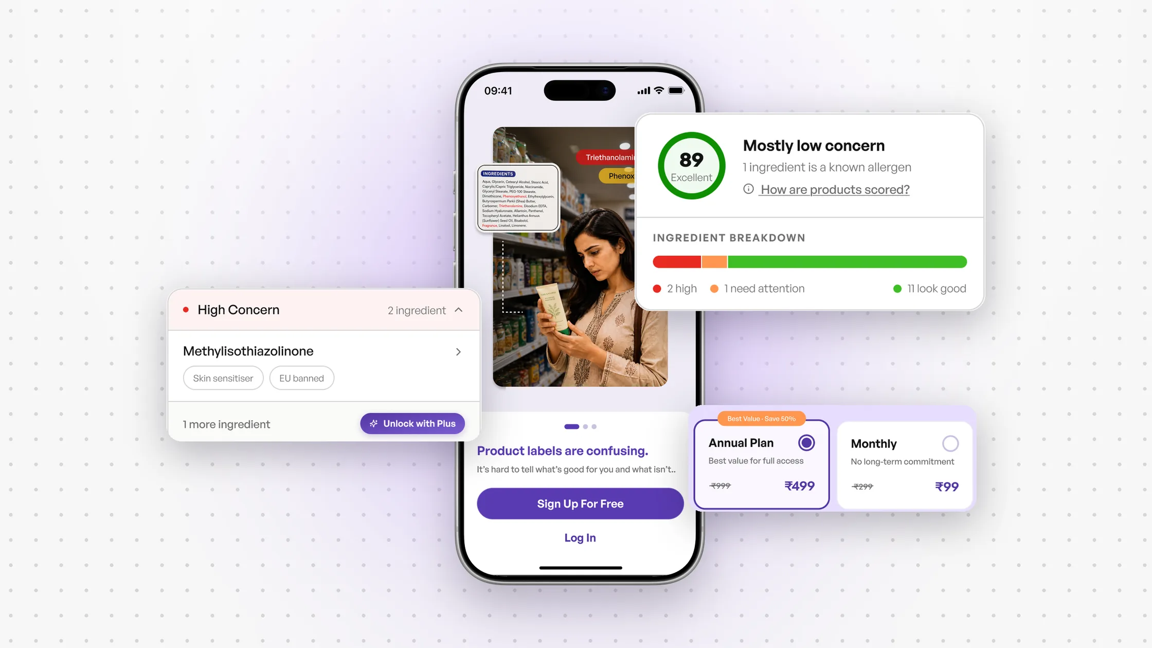
The short version
People liked TruthIn once they were in it. Getting them in, and getting them to pay, was the problem: they dropped off in onboarding, got lost on the beauty product page, and left the pricing page without subscribing.
I treated it as one journey with three leaks, and one idea ran through all three fixes: show the value before asking for a commitment. Sign-up now explains outcomes, with Google and Apple on every screen. The product page gives a plain answer first, inside strict legal limits on wording. Pricing went from three plans to two, without changing a single price, and Plus is offered at ₹99 a month at the moment someone wants more. All of it is live.
What I was handed
TruthIn is built on TIRS, the TruthIn Rating System. You scan a barcode and it looks at the product's nutrition, how each ingredient affects health, how processed it is, and whether it has additives worth worrying about. The point is to cut through what the label claims. TruthIn Plus, the paid tier, unlocks the full ingredient detail.
The team brought three problems. The first was in their own words:
"We're seeing strong engagement across the product, and users are actively reaching the pricing page. However, a large percentage of them leave without subscribing. Our activation rate is only ~7.8%. How might we improve pricing conversion without simply lowering the price?"
The second came from their interviews and a survey: people didn't understand the beauty product page, and the team suspected that was why they didn't pay. The third: a share of people left before finishing onboarding, so fewer ever reached that page at all.
The limits: prices couldn't drop, and legal rules meant no screen could call a product safe. I worked with a PM; the stakeholders made the final calls.
Why people left before signing up
The company wanted more registrations; that was the one number. So I wrote down the other side first: what someone opening TruthIn is trying to find out. "Is this safe for me? Is this causing my acne? Is this food harming my child?" And under those: can I trust this product, and am I being fooled by marketing?
Then I went through the app as a new user and noted what I felt, before any fixes.
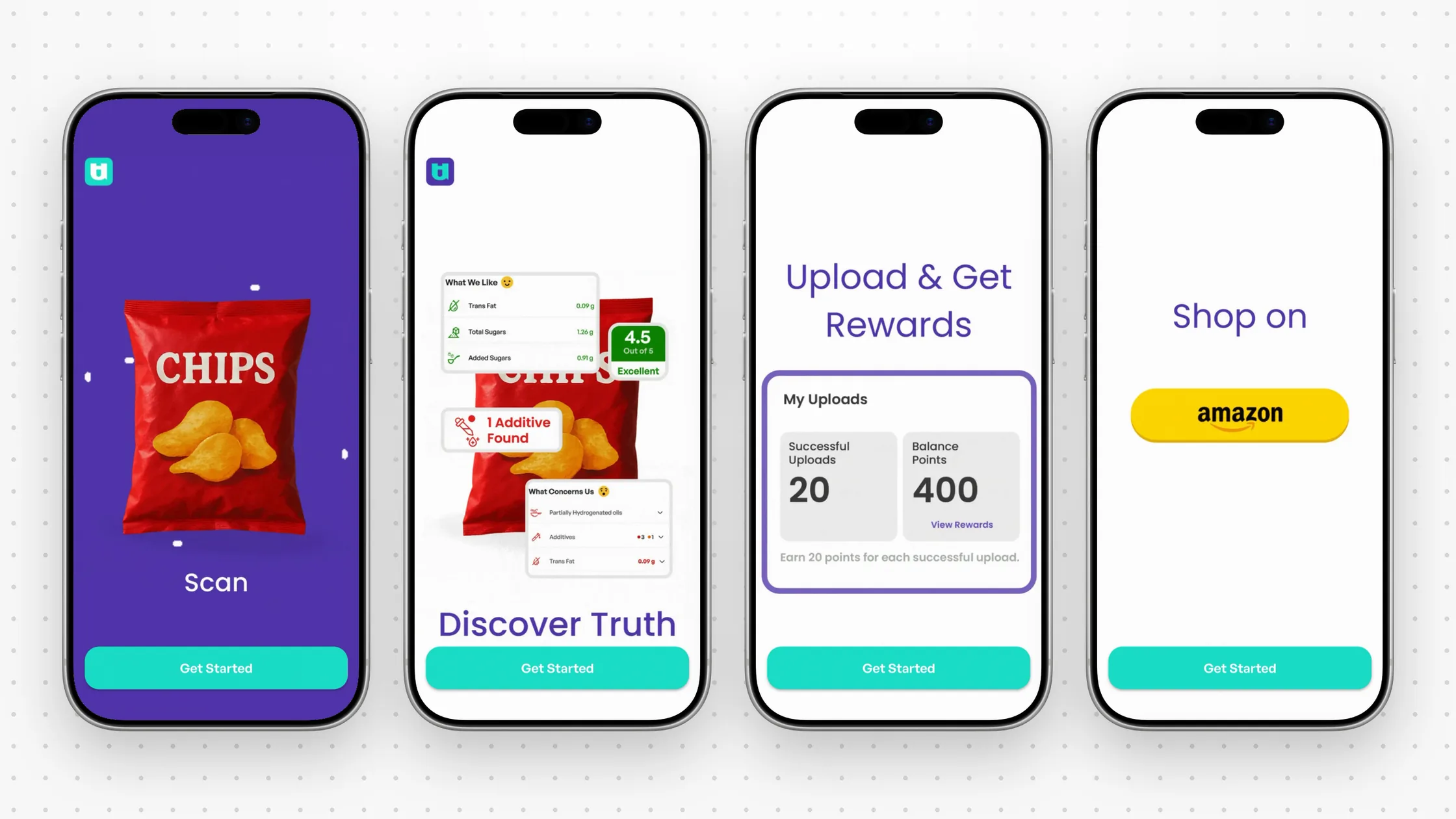
I couldn't tell how the app would help me, or why
Too fast, too much at once, in scientific words
Uploads and rewards: features, not reasons
Shop on Amazon, before the app has helped you
My note at the time: logical from a product perspective, backwards from a human psychology perspective.
What I thought was going on
Three guesses about the drop-off. People won't register for something they don't understand yet. Being asked to shop on Amazon so early suggests you'll have to buy something. And people want a quick way in, like Google or Apple.
The PM had numbers on the last one, from how people already sign in:
51.2%
sign up with Google (57% log in with it)
38.2%
sign up with mobile and OTP
10.8%
sign up with email (5% log in with it)
So the job was to answer four questions before asking for anything: is it useful for me, can I trust it, will it cost me money, and how quickly do I get value? My problem statement: people are asked to commit before they've seen enough value to justify it, and that uncertainty, early, is what drives the drop-off.
Four directions, two survived
I set out four directions, each with concepts under it, and scored them on impact, confidence and effort.
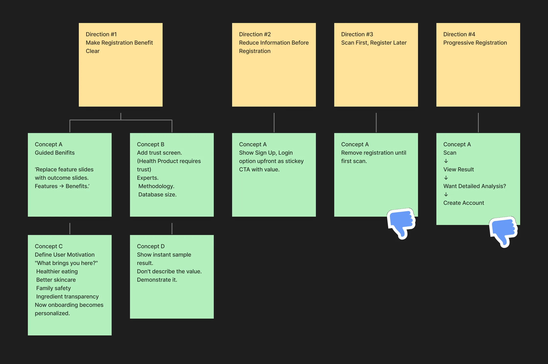
The PM and I took them to the stakeholders. They voted down both scan-first ideas, #3 and #4: letting people scan before registering needed big changes to the app's infrastructure, which meant far more development time and effort. We agreed to combine #1 and #2: say what you get in outcomes, not features, and put sign-up and log-in on every screen so nobody has to sit through the tour.
From sketches to the final flow
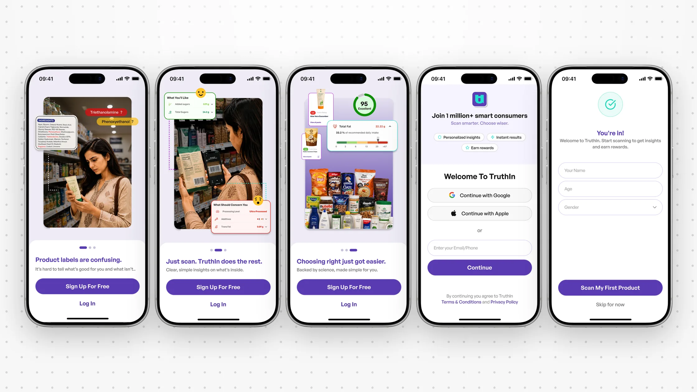
The first lo-fi turned feature slides into one outcome per screen, with the sign-up buttons always in reach.
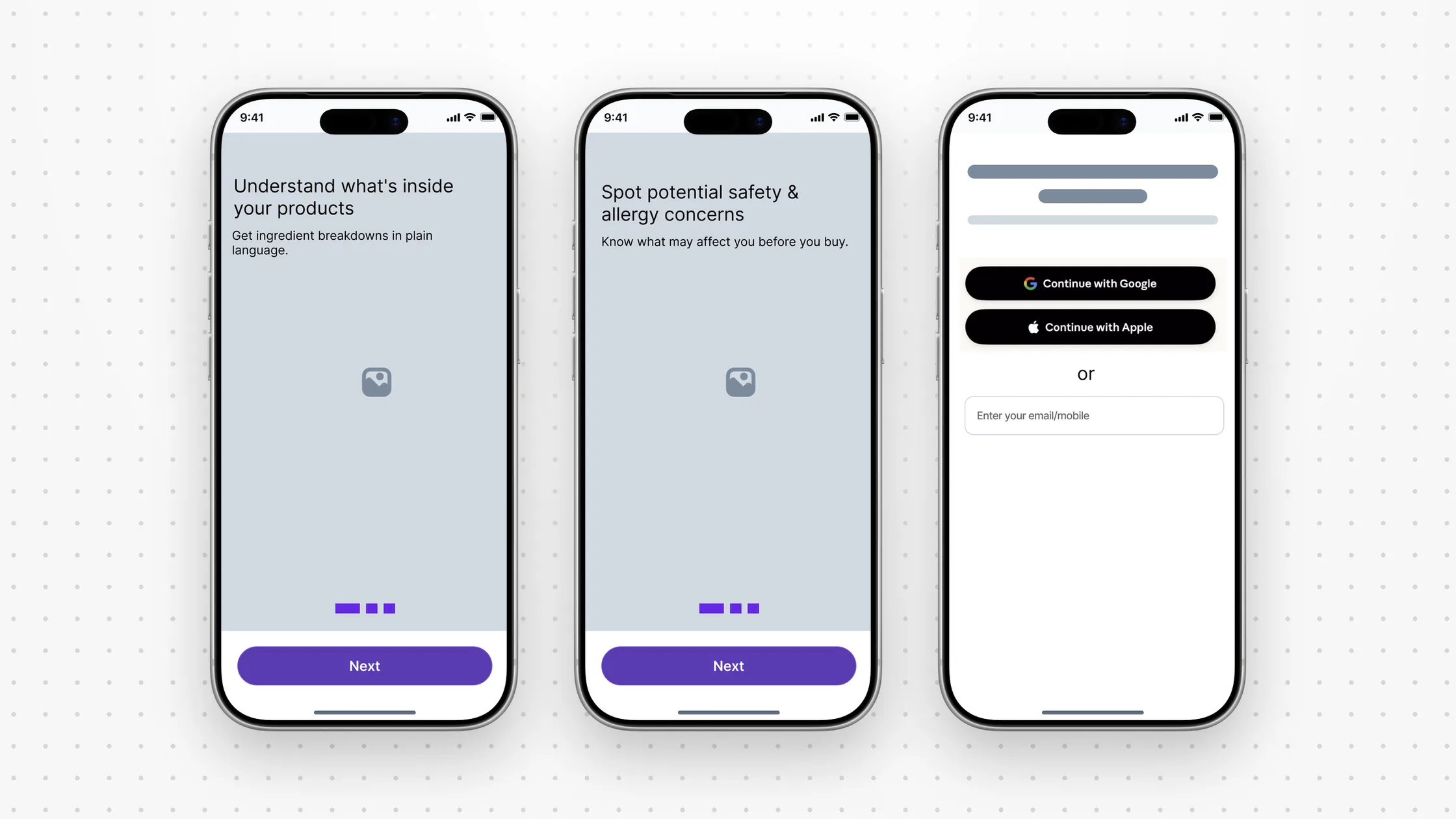
After a few rounds with the PM, the final flow is three screens, each one reason in plain words, then one screen to sign in with Google, Apple, or email and phone, then "You're in", where the first button is Scan my first product, not a tour.
What ten people told us
The beauty product page is where TruthIn earns its keep, and where the team's data said people stalled. We called ten people: five paying users who scan every day, and five who scanned a product here and left. Their problems lined up with my own audit.

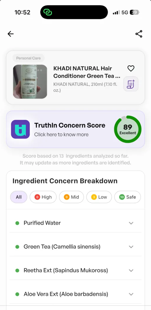
A score with no reason: 89 is "Excellent", and "Click here" doesn't say why
A flat list, safe ingredients first, the worrying ones further down
No reason to upgrade before the paywall
The disclaimer takes up a screen of its own
Three ways to answer "is this okay for me?"
I sketched three concepts, each with its own hypothesis.
- 01
A: same layout, clearer
Add a concern count under the score and list the worrying ingredients first. People understand faster, and nothing feels unfamiliar.
- 02
B: the answer first
Lead with a plain verdict, counts as pills, ingredients grouped by severity. People decide faster and see what Plus adds.
- 03
C: only what matters, open
Open the most serious group and collapse the rest. Less to read means a faster decision, and the tension matches the risk.
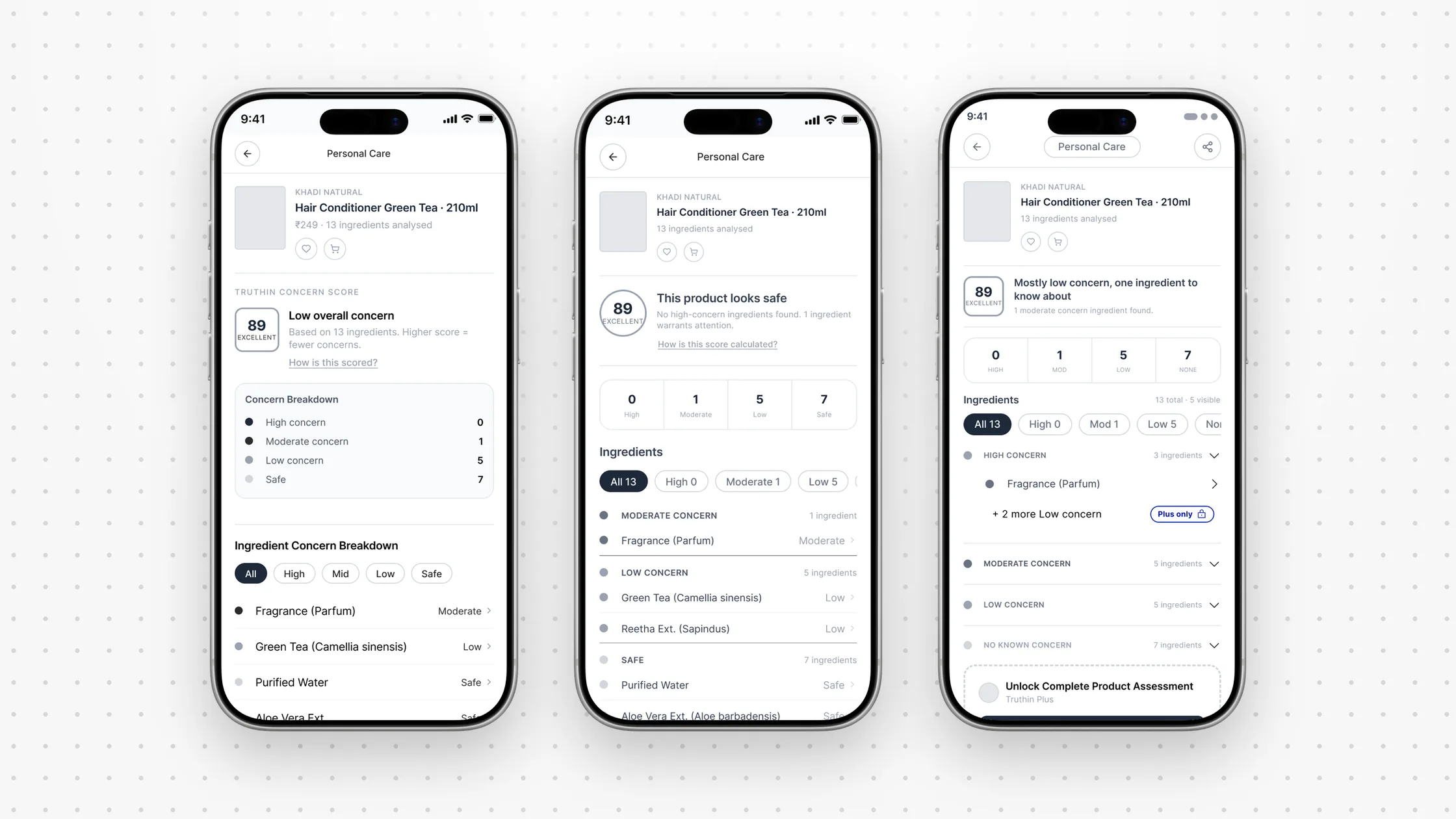
What went forward took B's verdict and C's focus. My reasoning: show what people care about most up front, and keep the other ingredients collapsed so attention goes where it's needed. The button changed from "Upgrade to TruthIn Plus" to an outcome, understand every ingredient before you buy, because people pay for confidence, not a data list.
Words we were allowed to use
Concept B opened with "This product looks safe". It read well, and it couldn't ship: legally, TruthIn can't call any product safe. The scientific copy itself came from the company's side. My part was the words around it: section titles and headings a shopper can judge at a glance, without claiming anything the science doesn't.
So the verdict became a heading per score band, plus one line that names the most important thing:
85 to 100: Excellent
"Mostly low concern". Names the most serious concern if there is one: "1 ingredient is a known allergen".
70 to 84: Good
"Some ingredients to watch". Says how many: "3 ingredients need a closer look".
55 to 69: Fair
"Several concerns found". The count and the worst type: "5 ingredients found with known concerns".
40 to 54: Poor
"High concern product". Names the most serious concern: "Contains ingredients linked to cancer risk".
0 to 39: Very poor
"Avoid if possible". The strongest honest statement, no exaggeration.
The groups got names a shopper would use too: High concern, Needs attention, Looks good.
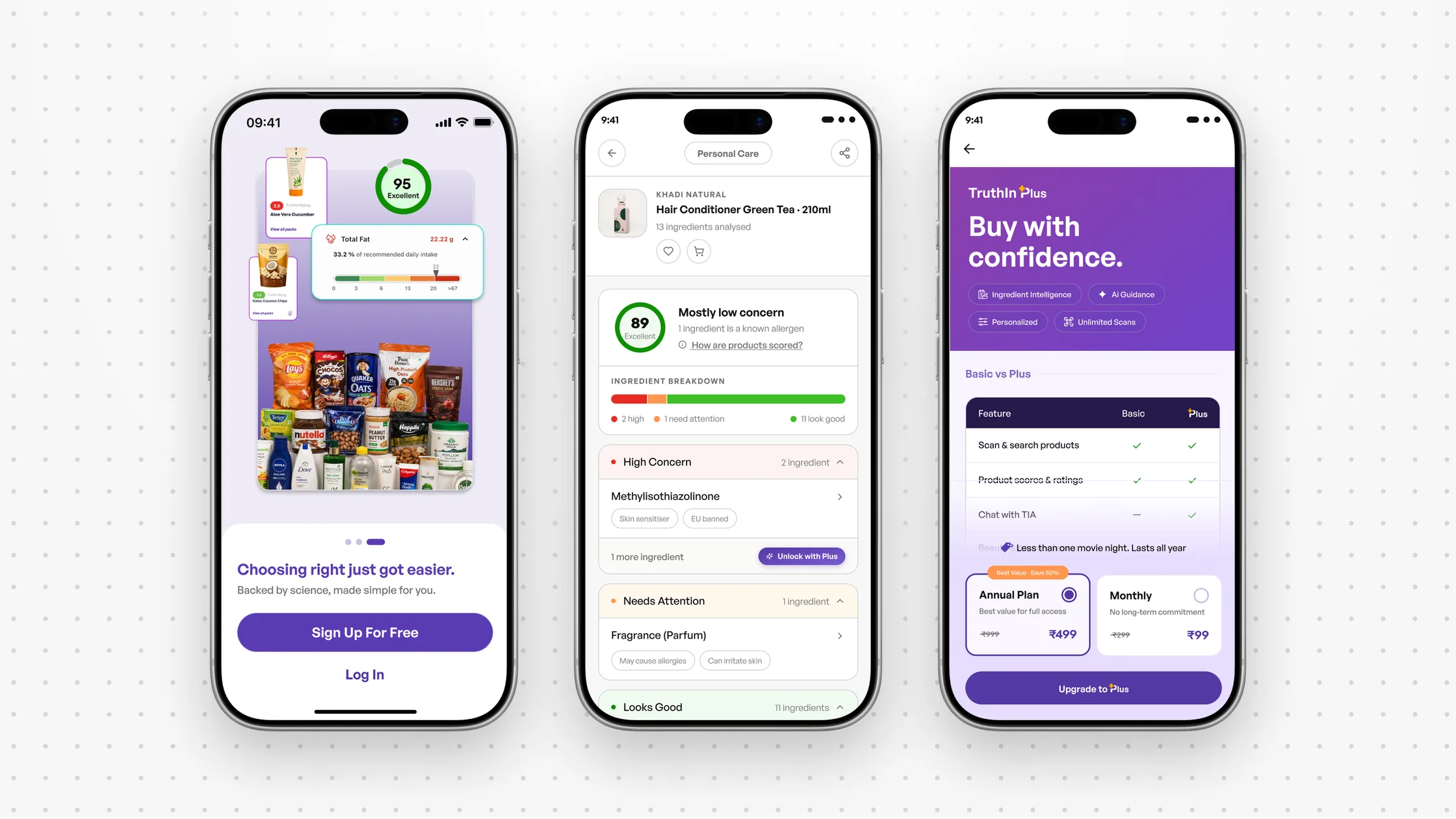
The same product, before and after
Before
The live product page
After
The answer first
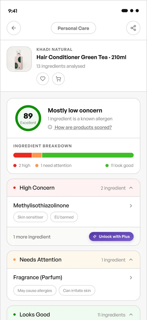
"Mostly low concern", and the one thing to know
The whole breakdown in one bar
The most serious group opens first; the rest wait
A locked row says what Plus gives, right where you are
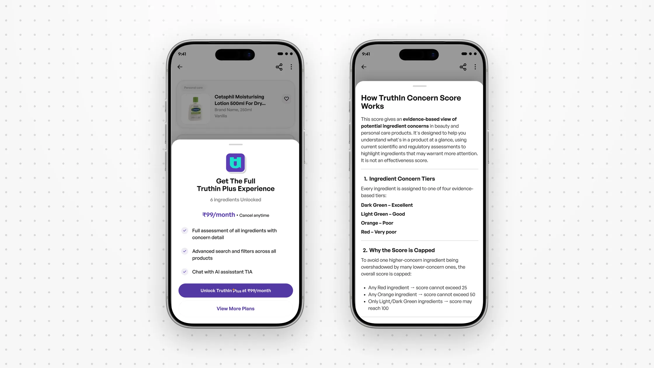
Tapping a locked row opens a sheet on the same screen. I chose a sheet over scrolling down to an upgrade card: on a long list people lose the ingredient they tapped. The upgrade card stays further down for people who scroll past.
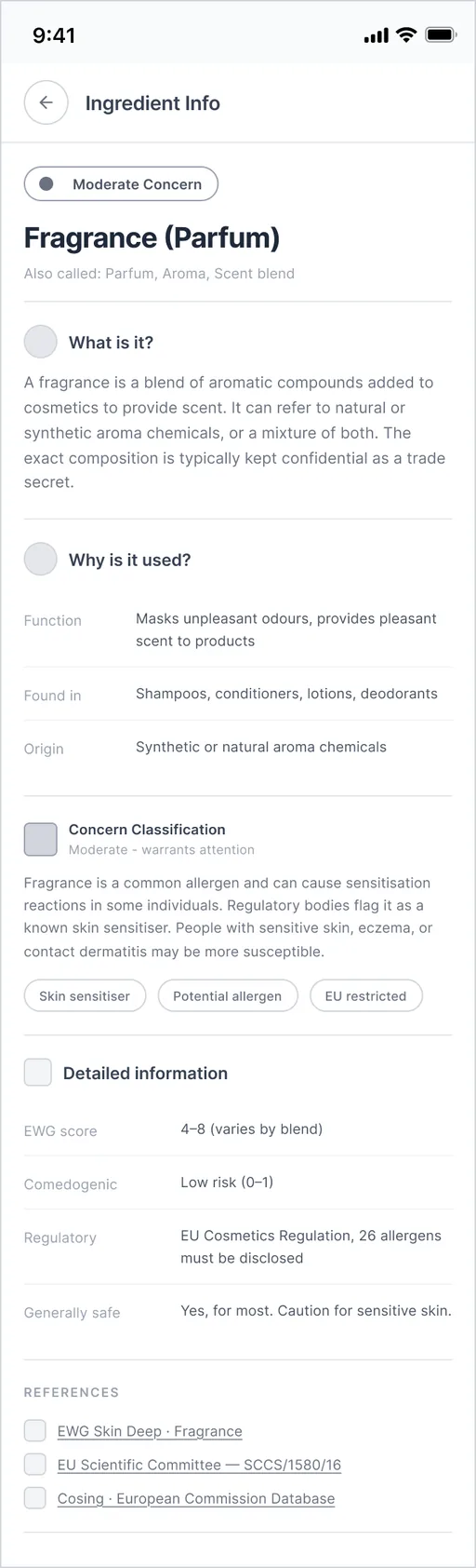
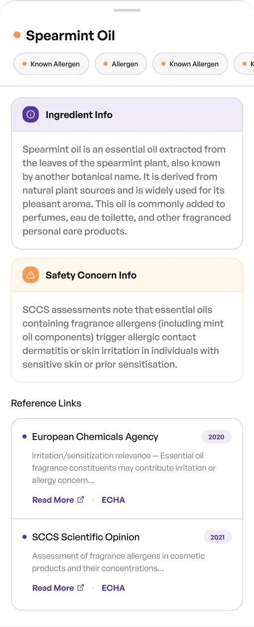
Ingredient pages people can read
Each ingredient opens into a page with a fixed order: what it is, why it's used, how concerning it is, the details, and the sources behind it. Sources matter here; a health claim needs one nearby.
Where pricing lost people
The goal here was conversion from people coming through the beauty pages. The team's numbers set the scale: 12% of people reach the beauty section, and 1 to 2% of them become Plus users. People aged 21 to 30 are the biggest group; 31 to 40 convert better.
I mapped every existing path that leads to the pricing page, to see where value was shown and where it wasn't.
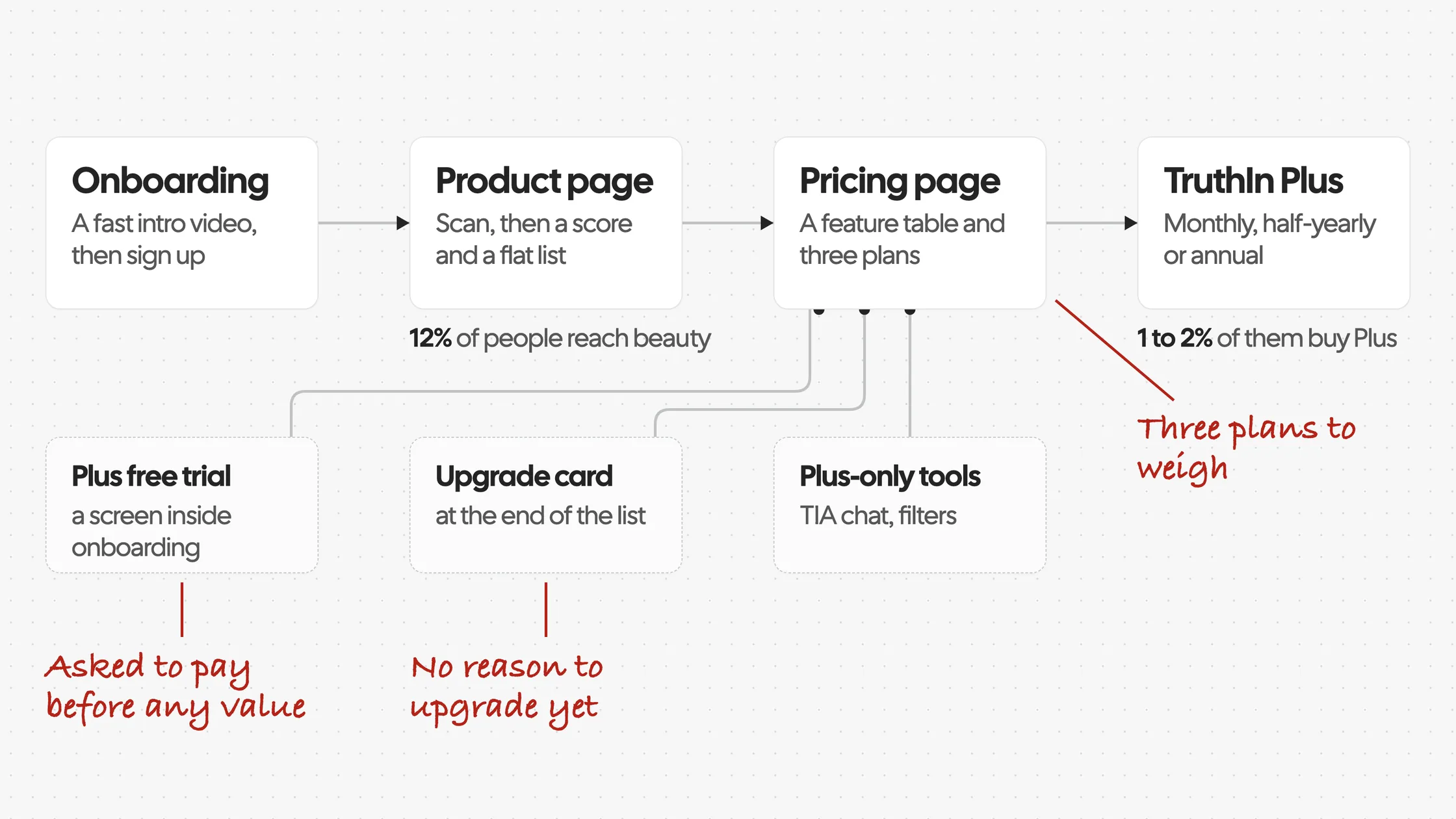
Three doors led to pricing, and none of them showed the value first. Then I looked at what people actually bought:
47%
of purchases: monthly, ₹99
14%
half-yearly, ₹299
37%
annual, ₹499
So we couldn't say "half-yearly doesn't work": it clearly had demand. The better question was whether people need a separate six-month plan, or a choice between flexibility and value.
If we reduce the pricing decision to two clearly different choices, flexibility or value, people may decide faster and with less second-guessing, without hurting retention or revenue.
So the proposal was monthly at ₹99 and annual at ₹499, against the existing three. No price changed.
Asking at the moment of interest
The other gap was timing: the value of Plus showed up late. The best moment to offer it is when someone taps something they can't see yet. So that tap opens a sheet that starts at the smallest step: ₹99 a month.
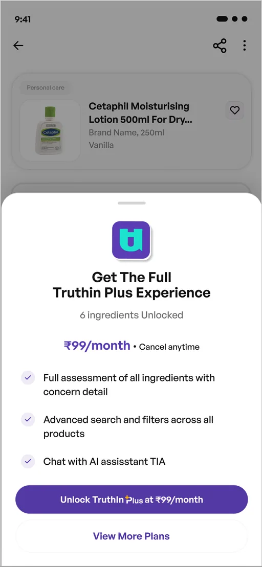
It counts what you'd get: 6 more ingredients, on this product
₹99 a month, cancel anytime: the smallest step in
Three benefits in plain words
The price is on the button
The other plans stay one tap away
Three versions of the pricing page
The first version was a feature table. The second led with the value, "Buy with confidence", and plain benefits. The third put the plans in reach on the first screen. The final cut the plans to two.
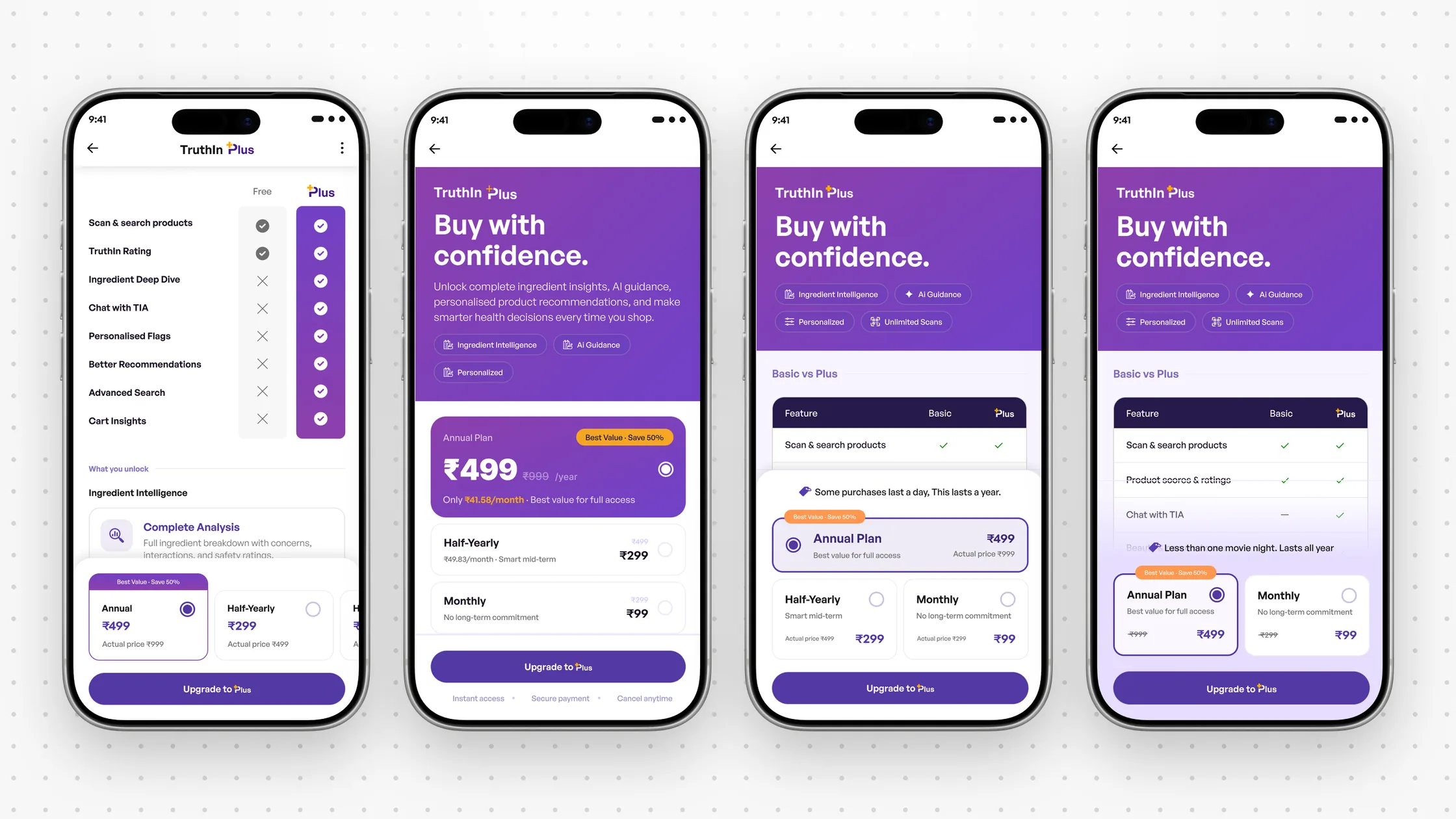
Making annual the primary plan was the stakeholders' call, for a bigger first purchase. I designed for it without hiding the other choice: annual is selected, monthly is one tap away, and the price is put in everyday terms.
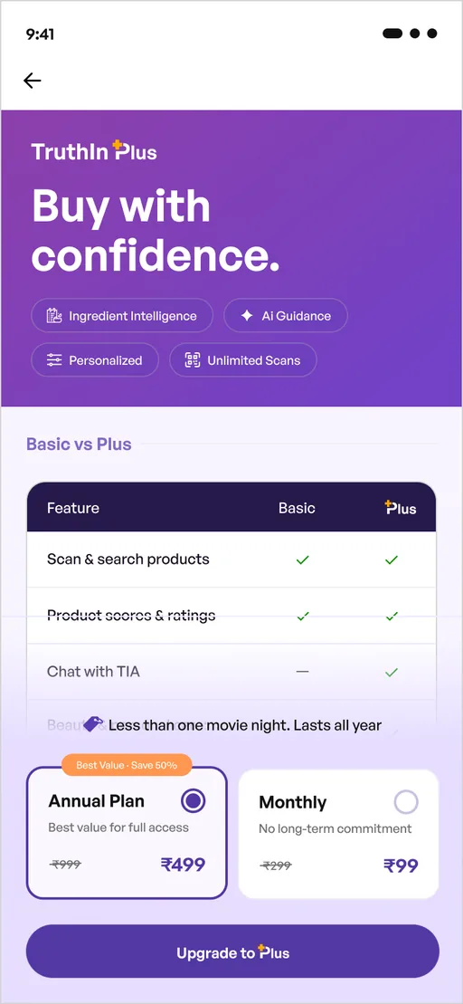
The promise first: "Buy with confidence"
What Plus unlocks, in four short chips
Basic vs Plus stays, below the promise
The price in everyday terms: less than one movie night
Annual selected, monthly one tap away
Keeping it buildable
A score can land anywhere from 0 to 100, so developers got rules, not examples:
- 01
Mostly green or orange
"High concern" stays closed if empty; the next group opens, highlighted.
- 02
Any red
"High concern" opens first.
- 03
The bar
Each colour's share matches its share of ingredients; an empty group says "0 ingredients".
The note on the handoff page said it plainly: build from the logic, not from the sample data.
Where it landed
All three parts are live in the app today, on iOS and Android. I don't have numbers since launch. What I'd look at: registration completion after the new onboarding, how many people go from a product page to pricing, and pricing conversion and the plan mix with two plans instead of three.
What it taught me
The three problems looked separate, and they weren't. Onboarding, the product page and pricing all asked for a commitment before showing the value. Fixing the order mattered more than any single screen.
A constraint can make the words better. Not being allowed to say "safe" pushed us to headings that tell people what to look at, which is more useful than a promise anyway.
And data changes the question. Half-yearly sold 14%, so it wasn't a failure. Asking flexibility or value? instead of which plan to cut? is what made two plans defensible.
The honest gap: everything shipped, and I haven't seen the numbers since. Next time I'd agree the measures with the team before launch, so the result is part of the work.
Written from my own notes, files and memory. Claude helped me structure it, word it and point out gaps.
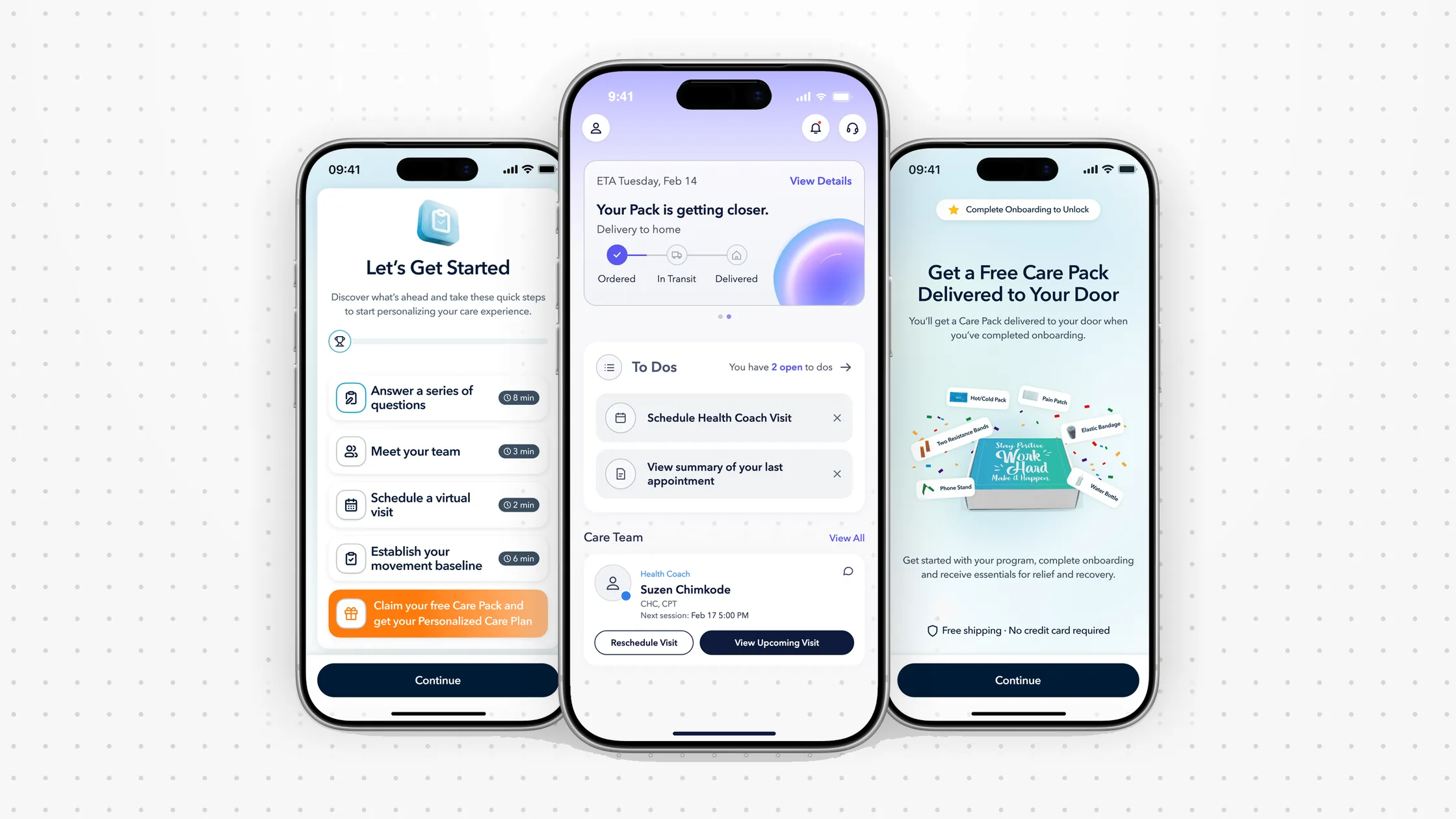
Healthcare platform
Sole product designer. Redesigned member onboarding across iOS, Android and web, with an AI guide that explains the care plan.
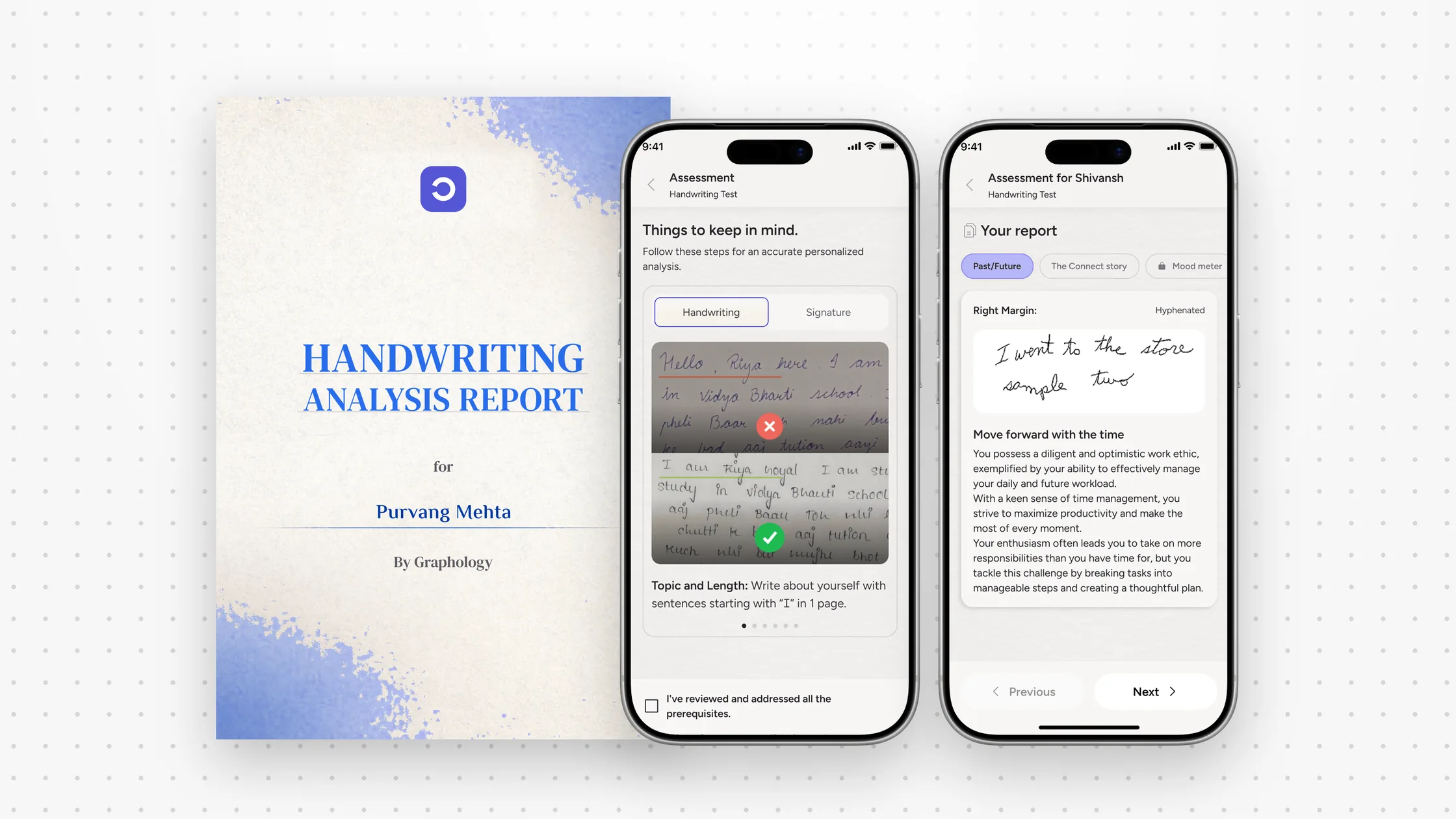
AI graphology
Designed an AI handwriting analysis product: the app, an expert's review of every AI reading, and the report.
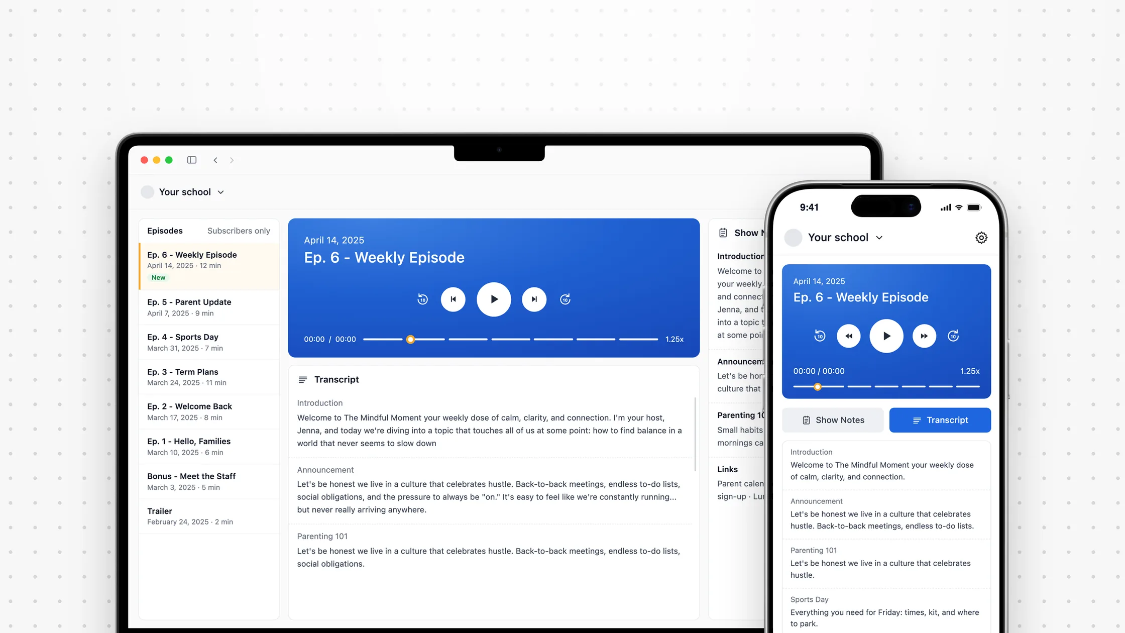
Communication SaaS
Sole product designer on a school audio platform: the episode builder, weekly templates, and AI that tidies scripts.
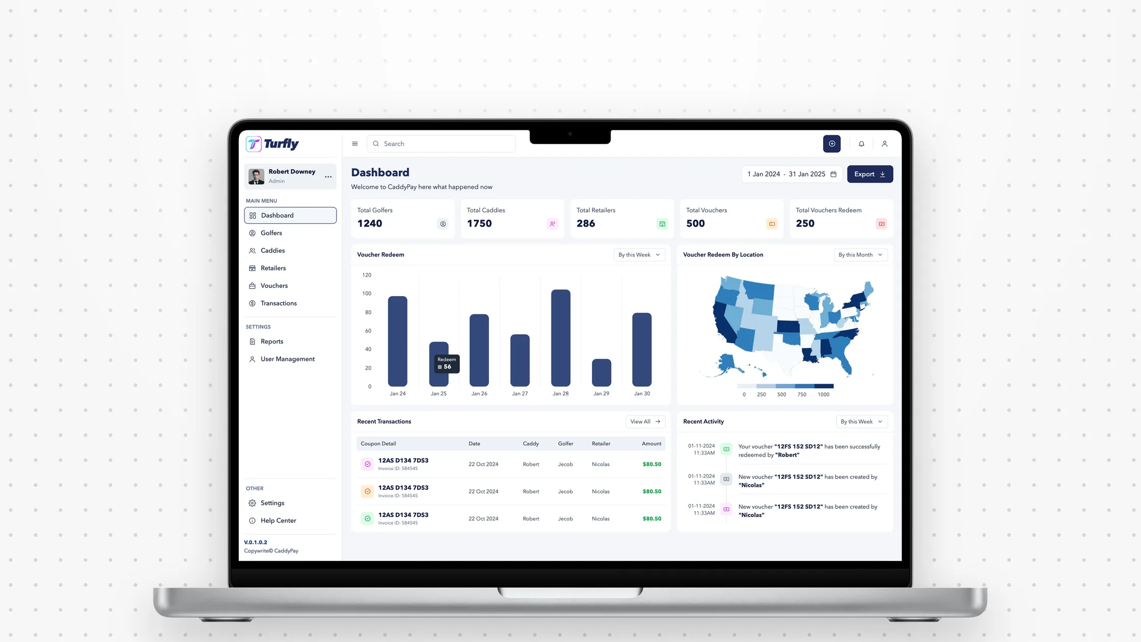
Turfly
Brand, design system and admin dashboard for a voucher-based caddy payment platform, end to end.