Redesigning the payment page of the Josh Talks English Speaking app
A payment page that looked normal but confused people about which plan to buy. The research, the competitor review, the options, and what the redesign changed.

Purvang Mehta · Product designer
11 March 2024 · 1 min read
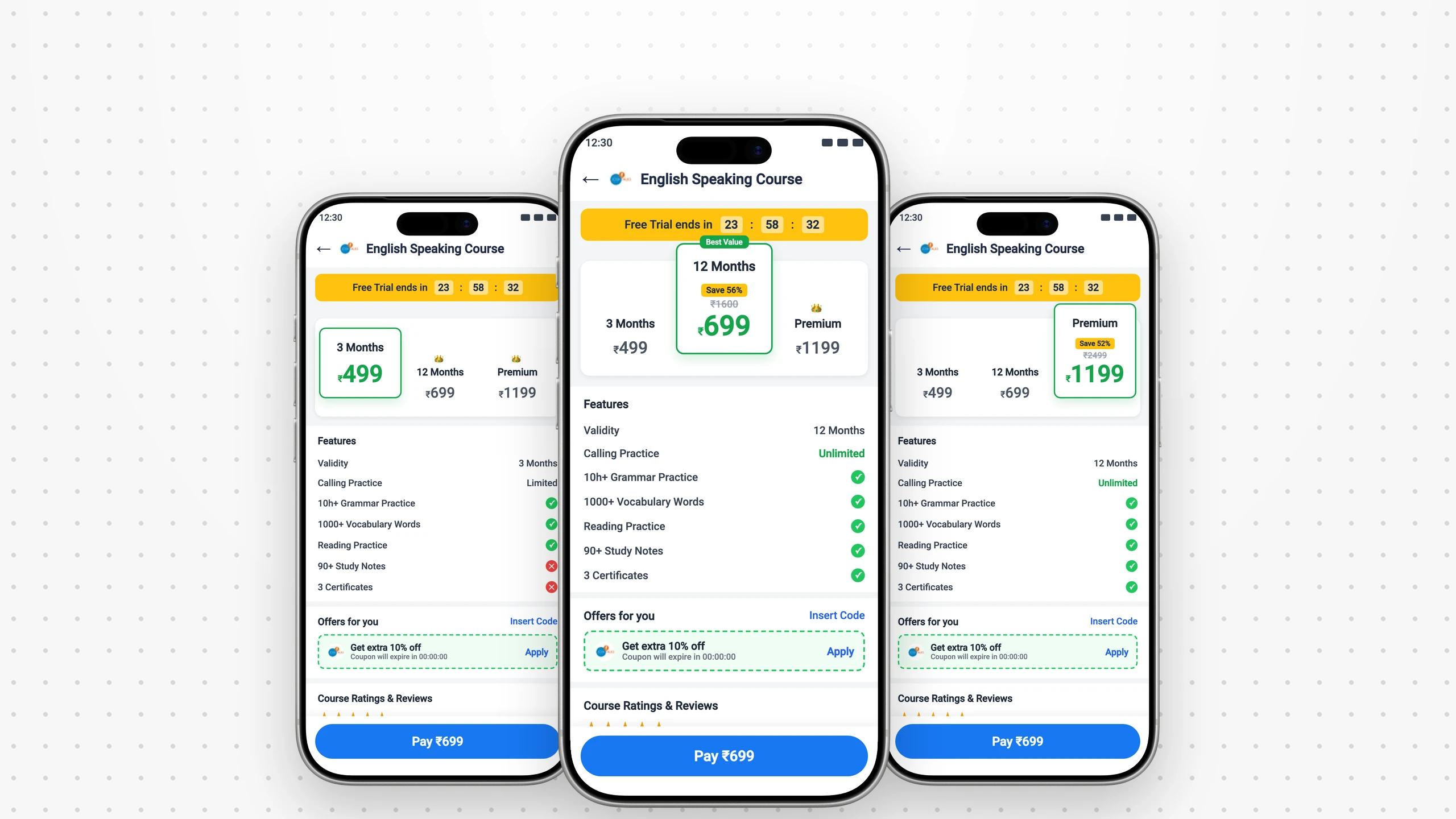
At Josh Talks I led the redesign of the payment page in the English Speaking app. It looked normal, but people were confused and struggled to finish paying.
+1.8%
conversion in the first month
80.4%
satisfied with the new look
18.7%
fewer payment errors
What was wrong
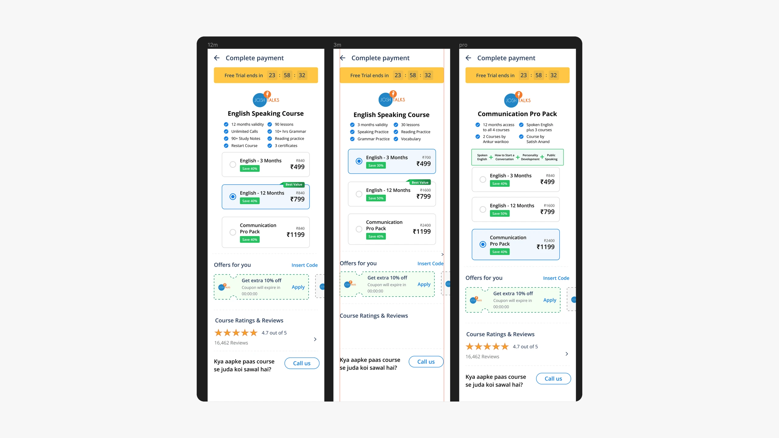
I asked users open questions: walk me through paying, what's hardest, how would you fix it.
45%
found paying confusing
3
plans to choose between
They couldn't tell what each plan gave them, so they bought the wrong one, or left.
The goals
Simpler
Make paying easier.
Clearer plans
Easier to compare, easier to choose.
One app
Match the rest of the app.
What the best apps do
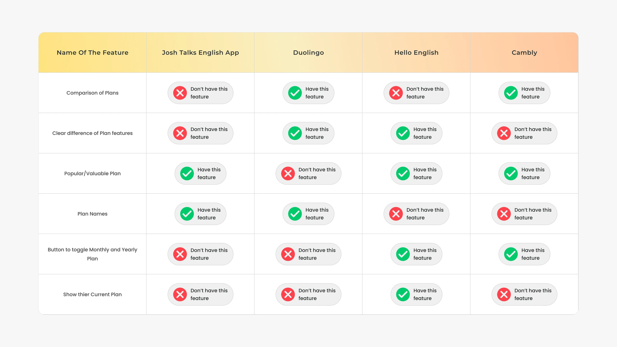
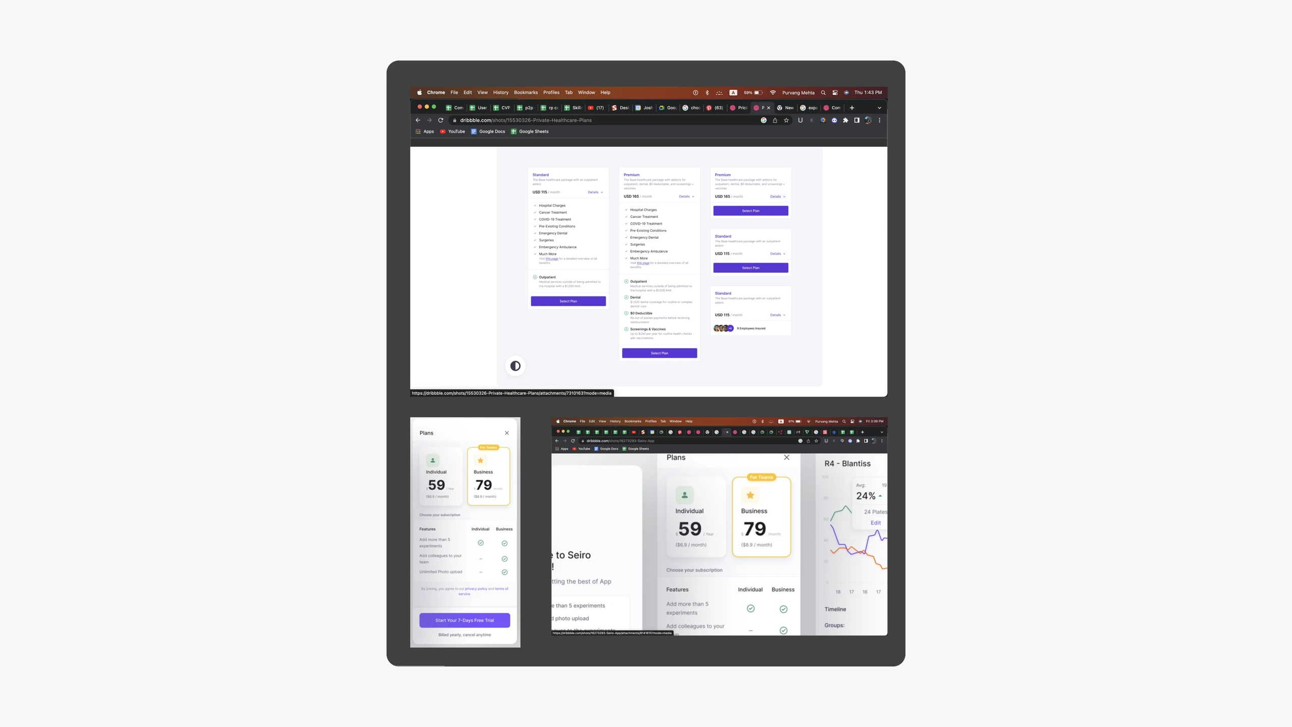
Duolingo, Hello English and Cambly all had simpler, clearer payment flows. I noted their patterns, and what we could adapt.
Designing it
- 01
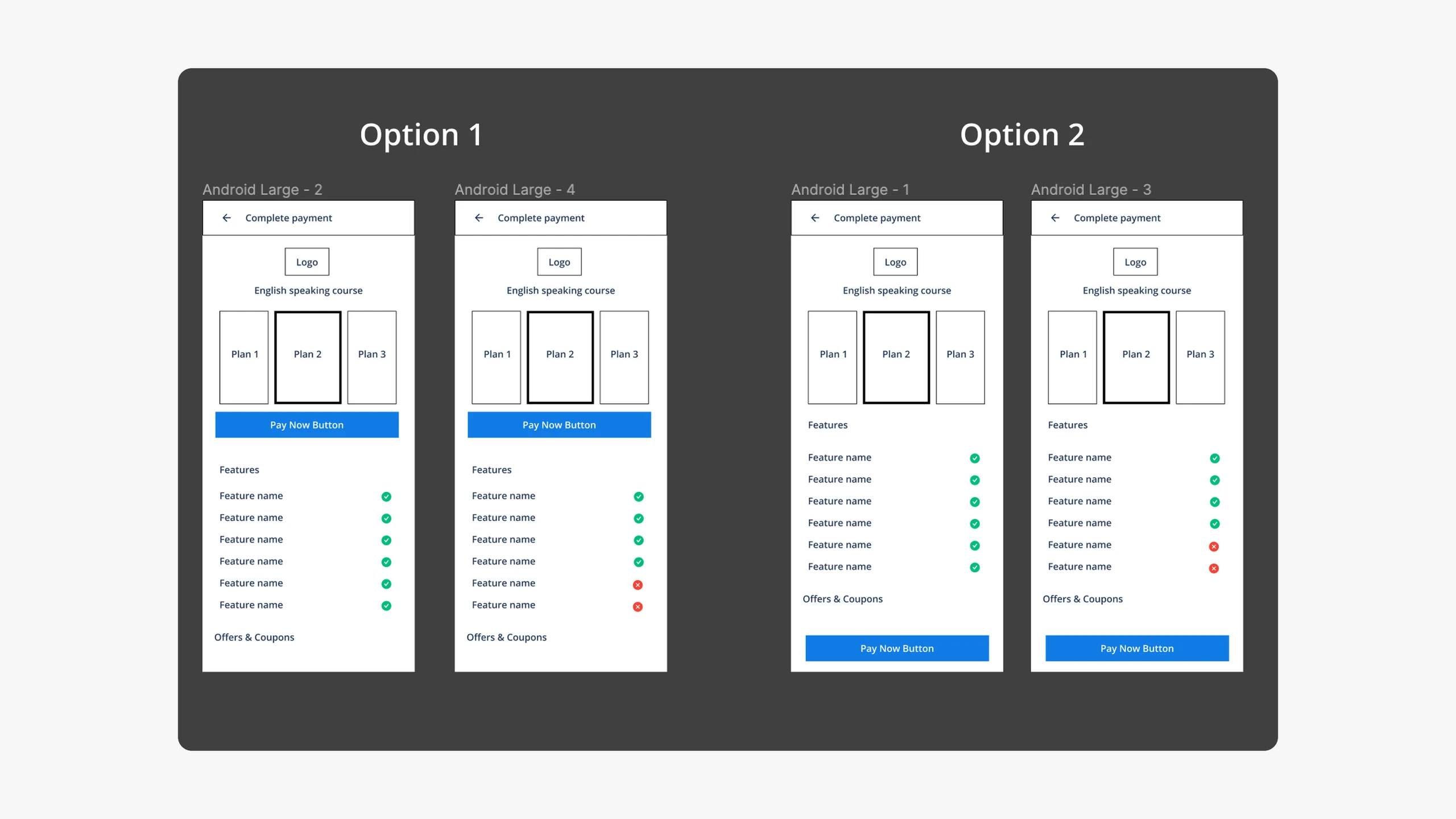
Wireframes
Two options, aimed at the pain points users named.
- 02
Feedback rounds
Stakeholders and user testing, several times.
- 03
Visual design
A simpler layout and a clearer hierarchy.
The final design is at the top of this page.
Results
What changed
- Simpler layout
- Clearer hierarchy
- Clearer navigation
What it did
- Conversion up 1.8%
- 80.4% satisfaction
- 18.7% fewer errors
It worked because it fixed the problems people named, and borrowed what the best apps already do well.
First published on Medium in March 2024.